Why Mobile Responsive Dental Website Design Is So Crucial
In our last blog post, we revealed everything you need to know about dental website design and how to create a site that actually converts web traffic into lifetime dental patients.
One of the key points that we mentioned was ensuring that your dental website is designed to be mobile responsive. As promised in the post, today we are going to go over exactly what mobile responsive design means—and why it matters for you and your dental website.
The staggering importance of mobile responsive dental website design is only going to increase in the future, so this is one topic your practice won’t want to miss! Now, let’s dive in:
**********************************************************************************************************
Looking for More New HIGH QUALITY Patients? Schedule a Strategy Session Today: Click Here
**********************************************************************************************************
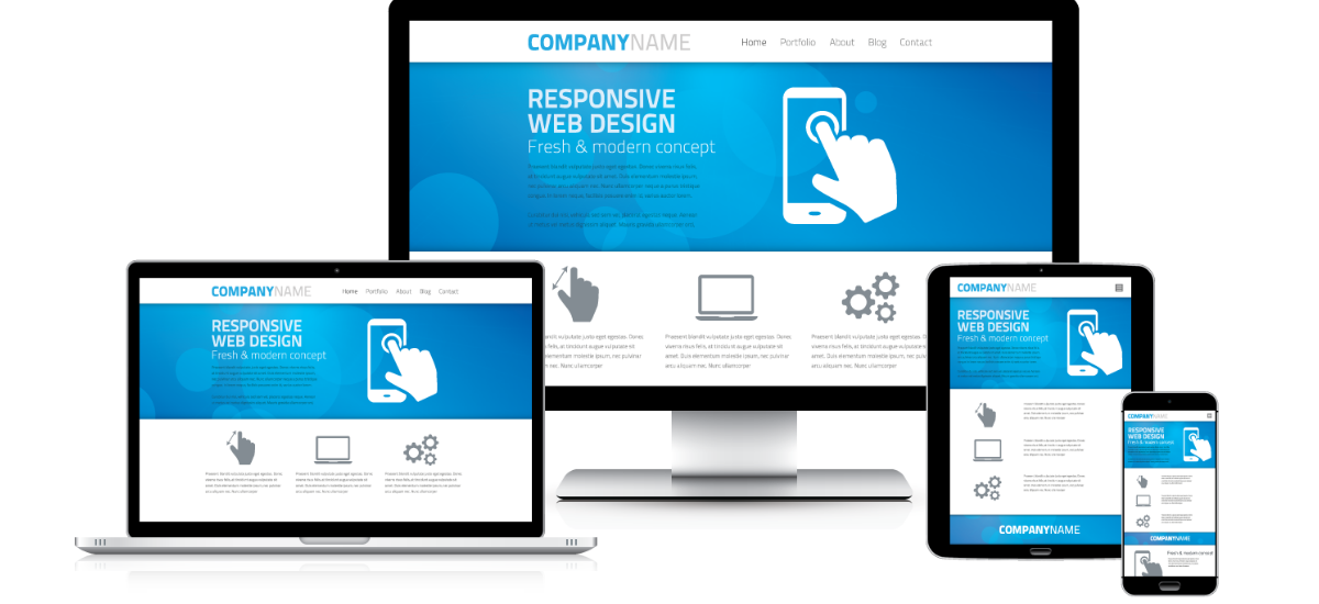
What Is Mobile Responsive Design?
A website is considered to be mobile responsive, or mobile friendly, if it is optimized for use on mobile devices. This typically means how quickly the site loads, the proportion of the images, and if the spacing and text adjust for use on a mobile screen.
Essentially, your mobile web traffic wants to be able to view and interact with your website with ease at all times, with minimum adjusting, waiting, resizing and scrolling. This means that you must have one website that is coded to adapt to all screen sizes, no matter what device the website is being displayed on.
Why Mobile Responsive Websites Are So Important
With some 60% of people navigating the web from their mobile device, how your dental website looks on a smartphone or tablet has never been so important. And it’s clear that mobile usage is only continuing to grow each year, with no signs of slowing down. If your website is not easy to navigate or does not convey trust on a mobile device, then you will continue to miss out on dental patients and profit.
What’s more, Google now favors mobile responsive websites.
Earlier this year, Google made updates in the way that they rank websites in mobile search. Now, if a website is deemed by Google’s “bots” as being mobile friendly, then it can get a boost in search engine results. Given the sheer number of people who are using their mobile devices to navigate the internet, this update makes a lot of sense.
However, if your website is not mobile-friendly, then this update means that your dental website could begin to rank lower in mobile search results than in previous years. And that very quickly equates to a lot of lost traffic, lost conversions—and lost profit.
How To Tell If Your Website Is Mobile Friendly
The two primary factors that we are looking at to deem if a website is mobile responsive are:
- How the website looks on a mobile device
- How fast the website loads on a mobile device
If you’ve never looked at your website on your smart phone, then take a moment to type in your URL in your mobile device. Notice how long your dental website takes to load. If you were a potential patient landing on your site for the first time, what would you think?
It’s not always easy to objectively judge our own website, but luckily, there are tools available to streamline the process.
The first resource that your dental practice should take advantage of is Google’s Mobile-Friendly Test. Now, there is no ambiguity as to how Google sees your website in the mobile search engines. Simply type in your website’s URL, click ‘Analyze’ and you’ll quickly receive either a yes or no answer as to whether your website is considered mobile friendly or not.
Now, we want to check and see how quickly your mobile website loads. For optimal results we want the speed time to be under one second. However, Google also has a tool that will rank your PageSpeed on a scale from 1 to 100—100 being the best. Along with your score, the tool will tell you exactly what you need to do to improve your mobile PageSpeed score.
Real-Life Results That Prove The Power Of A Mobile Responsive Website
If you’re still not convinced that a mobile responsive website will make a substantial difference in your practice’s bottom line, then take a look at this real-life case study with Dr. Lingo.
We designed a new website for Dr. Lingo that focused on the user experience—no matter what device or search engines potential patients were using to look for Dr. Lingo. After just 60 days, the results of Dr. Lingo’s new, optimized and mobile responsive website were staggering! Dr. Lingo went from zero to 40 leads per month! What’s even better, Dr. Lingos’ website continues to attract high-quality patients and walk-ins every single month.
Here you can see we transformed Dr. Lingo's website from this unresponsive, confusing website:
Mobile responsive design can make or break the success of your dental website. And with mobile search predicted to continue growing each year, this is one crucial element your practice does not want to miss out on. If your website is not mobile friendly, consider getting in touch with us to start driving more leads and profit to your practice today.
Action Items:
1. Test whether your website is mobile-friendly using Google's free Mobile Friendly Test.
Estimated Time: 5 Minutes
2. Check PageSpeed using Google's free tool to see where your website ranks and what necessary adjustments you can make. Remember, you can always call on us to implement the suggestions you see.
Estimated Time: 5 Minutes
Further Reading